
Black Backdrop vs. White Backdrop: Choosing the Right Look for Your Media Day
Media Day Backdrop Takeaways at a Glance
- FBR Media Group, powered by Rob Faber Photography, runs high school and college sports media days on site across Northern Connecticut and Western Massachusetts.
- Your media day backdrop sets the tone for every image in the gallery, from roster photos to game day graphics.
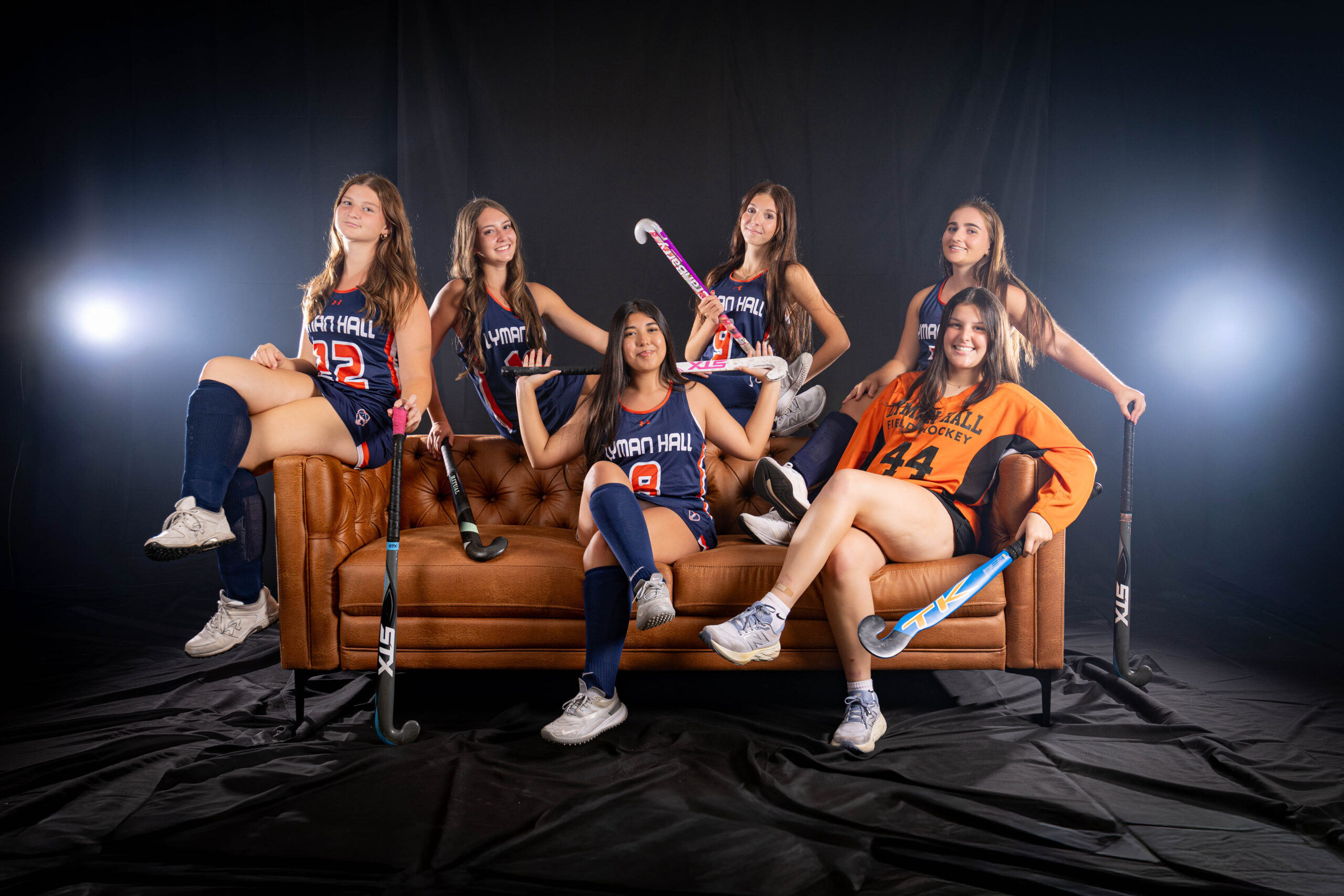
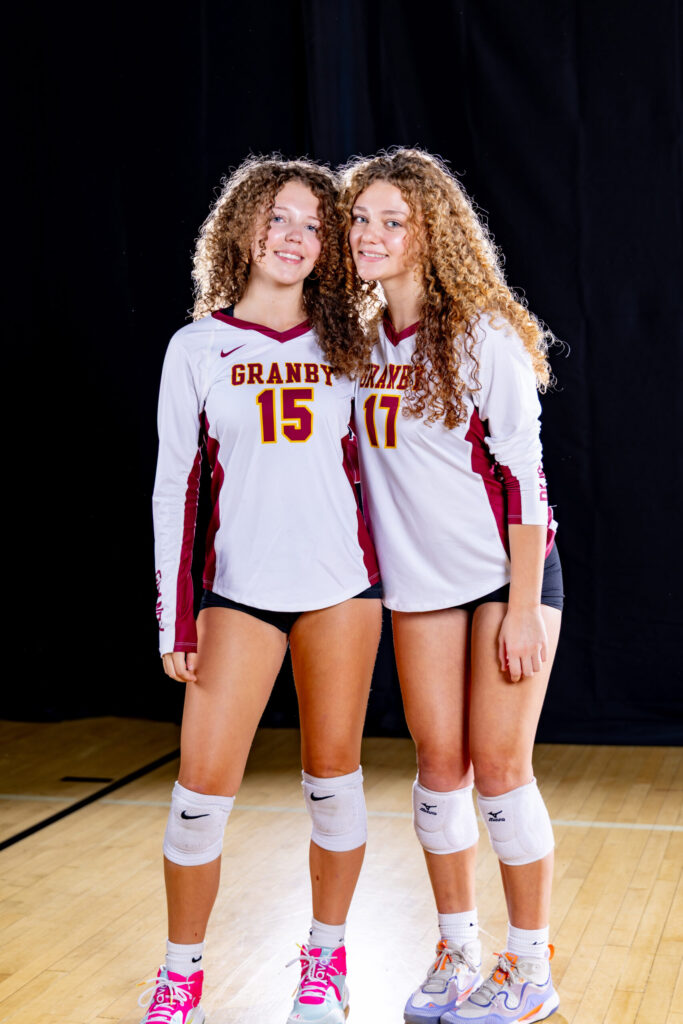
- A black backdrop with smoke creates an edgy, dramatic, cinematic look. It also hides busy surroundings, makes team colors pop, and gives designers a dark canvas for hype graphics.
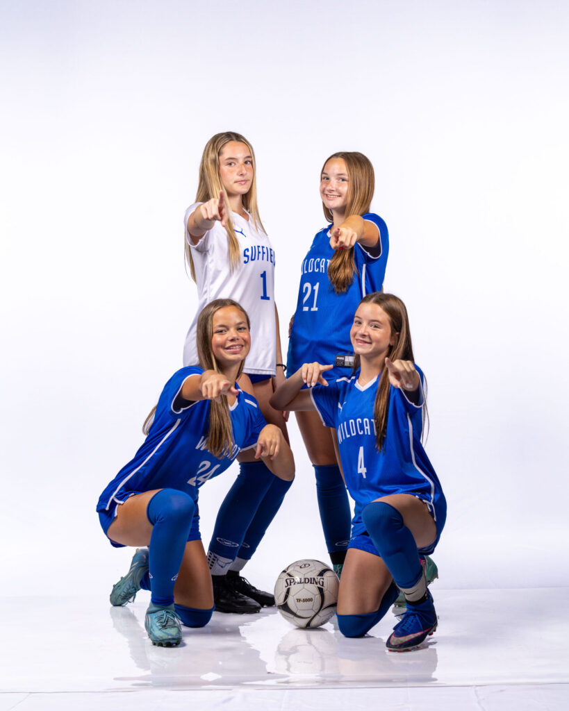
- A white backdrop creates a clean, crisp, modern look. It is consistent across rosters, easy to cut out for graphics, and timeless for yearbooks, programs, and team pages.
- You do not have to choose just one. Many programs run both looks in the same day.
Walk into any college athletics media day and you will usually see one of two looks. Either athletes are emerging from darkness and haze, lit like the opening shot of a highlight reel, or they are standing against bright, seamless white, sharp and clean like a pro roster page. Both are powerful. However, they say very different things about a program.
Choosing your media day backdrop is one of the biggest creative decisions you will make in planning. It shapes the mood of the images, how they work in graphics, and how they look on everything from Instagram to the yearbook. Below, I will break down what each backdrop does well, what to plan around, and how to decide which one fits your team.
The Black Backdrop With Smoke: Edgy, Dramatic, Cinematic
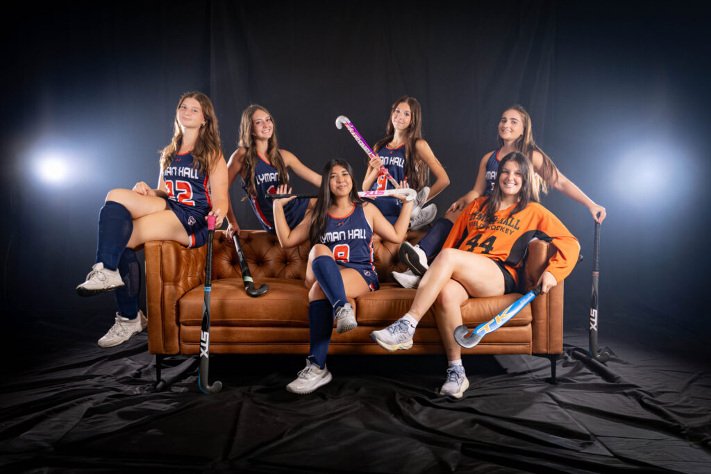
A black backdrop with smoke is the look most athletes picture when they hear “media day.” It feels intense, focused, and a little larger than life.
Drama and Intensity
On black, the athlete is the only thing in the frame that matters. Light carves out shoulders, arms, and the edges of the uniform, while everything else falls away into shadow. That contrast creates an intensity that feels made for game day. It is the visual equivalent of walking out of the tunnel.
Smoke Adds Depth and Atmosphere
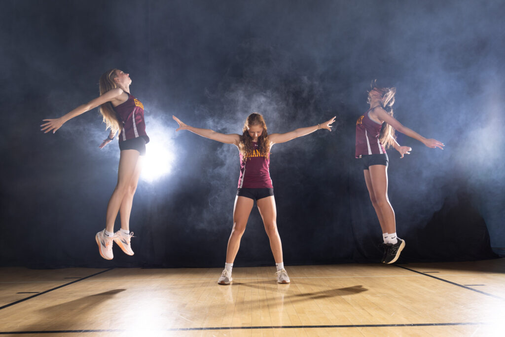
Smoke is what takes a black backdrop from dark to cinematic. When light passes through haze, it becomes visible. Beams, glows, and soft textures appear behind and around the athlete, adding layers of depth that a flat background cannot. Every frame has a slightly different swirl, so the images feel alive rather than repetitive.
Smoke also works beautifully with colored light. A splash of your team colors in the haze ties the image directly to the program without adding a single graphic.
It Hides the Room
Here is a practical advantage many coaches do not expect. A black backdrop, paired with controlled light, makes the surroundings disappear. A gym, cafeteria, or multipurpose room can look like a professional studio, because nothing outside the light shows up in the image. As a result, you get a polished, high-end look no matter where the set is built.
Team Colors and Uniforms Pop
Against black, color jumps forward. Bright jerseys, white uniforms, gold trim, and metallic helmets all stand out with strong separation from the background. Light-colored uniforms in particular look sharp and bold on a dark set.
Built for Hype Graphics
Black backgrounds blend seamlessly into dark graphic templates. Game day announcements, starting lineups, senior night posts, and commitment graphics often use dark designs with bold text, and a black backdrop image drops right in. For programs that post often on social media, this alone can make black the right choice.
What to Plan Around With Black and Smoke
- Smoke detectors. Haze can trigger some fire alarm systems. Coordinate with your facilities team before the day so the space is approved and the right steps are taken.
- Ventilation and comfort. Smoke should be used thoughtfully. If any athletes are sensitive to haze, let me know ahead of time and we can adjust.
- Variation between frames. Smoke moves, so no two images are identical. That is part of the appeal, but it means less uniformity across a roster than a white backdrop.
- Dark uniforms. Black or navy jerseys need careful rim lighting to separate from the background. It works, but it is worth mentioning in planning.
The White Backdrop: Clean, Crisp, Timeless
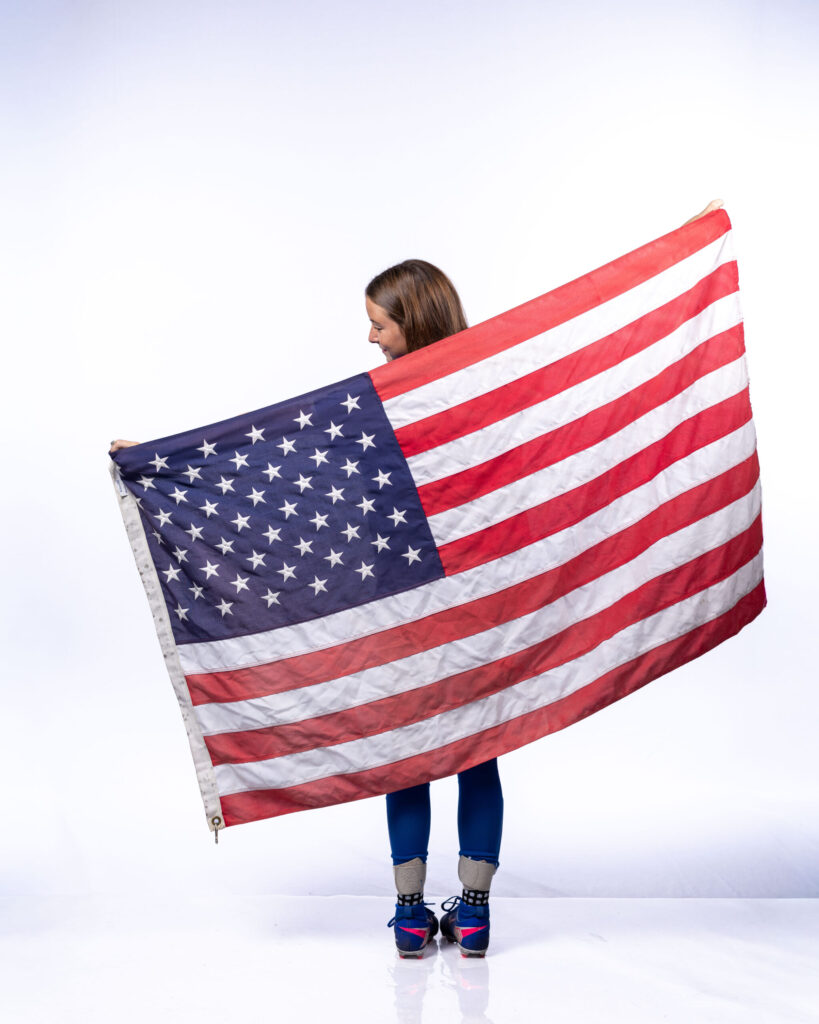
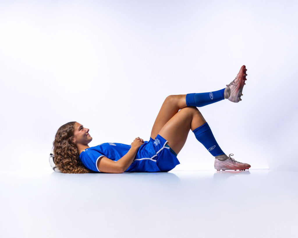
A white backdrop delivers the opposite feeling. It is bright, modern, and polished, the look of a professional roster page or a national brand campaign.
Clean and Professional
White strips away everything except the athlete. The result is crisp, confident, and easy to read at any size. It signals a program that is organized, professional, and serious about how it presents itself.
Consistency Across the Roster
White excels at uniformity. Every athlete is lit the same way against the same clean background, so the full set matches from the captain to the freshman on the JV roster. That makes a white backdrop ideal for roster photos, team pages, programs, and any layout where images sit side by side.
Easy Cutouts for Designers
A clean white background makes it far simpler to remove the background and place the athlete onto any design. Graphic designers, yearbook staff, and team social media managers can drop athletes into new layouts, collages, and templates without fighting a busy or textured background. For programs that want maximum flexibility, this is a major advantage.
Timeless for Yearbooks and Print
White does not chase a trend. It looks as current years from now as it does today. That makes it a strong choice for yearbooks, printed programs, banners, and keepsakes that families will hold on to long after the season ends.
Dark Uniforms Stand Out
Just as light jerseys pop on black, dark jerseys stand out on white. Navy, black, maroon, and deep green uniforms look bold and defined against a bright, clean background.
What to Plan Around With White
- Space and lighting. A true, clean white requires the background to be lit separately from the athlete. That takes more room and more lights than a black set, so ceiling height and floor space matter.
- White uniforms. Athletes in white jerseys can blend into a white background without careful lighting. It is solvable, but worth planning for.
- Less mood. White is clean and energetic, but it does not carry the same drama as smoke and shadow. If your athletes are hoping for an intense, cinematic look, black will get them there faster.
How to Choose the Right Media Day Backdrop
If you are unsure which direction fits your program, a few questions will help.
How Will the Images Be Used?
If the gallery will feed game day graphics and social media hype, black with smoke is a natural fit. If it will mostly fill rosters, programs, yearbooks, and team pages, white offers consistency and flexibility.
What Color Are the Uniforms?
Light uniforms tend to pop on black. Dark uniforms tend to pop on white. Either can work with the right lighting, but your jersey colors are worth factoring in.
What Is Your Program’s Personality?
Gritty and intense, or clean and polished? The backdrop should feel like your team. Ask your athletes, too. They often have a strong opinion, and their excitement about the look is part of what makes a media day work.
What Does Your Space Allow?
A black set can transform almost any room. A white set needs more width and height to light properly. If you are still deciding where to host, my guide to [choosing indoor vs. outdoor media day locations](INSERT LINK TO INDOOR VS OUTDOOR MEDIA DAY POST) walks through what each space offers.
Why Not Both?
For many programs, the best answer is two looks in one day. A white station can handle clean roster images while a black station with smoke creates hero shots and hype content. Athletes move from one set to the other, and the program leaves with a gallery that covers every need, from the yearbook to the starting lineup graphic.
This approach works especially well on a multi-team or school-wide media day, where a large room or gym gives enough space to run both setups side by side. To see how different sports use these looks, read What Is Sports Media Day? Basketball Focus and what a football media day is all about.
Frequently Asked Questions
Is a black or white backdrop better for media day?
Neither is better in every case. A black backdrop with smoke creates a dramatic, edgy look that works well for social media and game day graphics. A white backdrop creates a clean, consistent look ideal for rosters, programs, and yearbooks. Many programs choose both.
Will smoke set off the fire alarm?
Haze can trigger some fire alarm systems, so we coordinate with your school’s facilities team before the media day to make sure the space is approved and properly prepared.
Which backdrop is best for graphics and cutouts?
A white backdrop makes it easiest to remove the background and place athletes into new designs. A black backdrop blends naturally into dark graphic templates without needing a cutout at all.
Do uniform colors matter when choosing a backdrop?
Yes. Light uniforms tend to stand out on black, while dark uniforms stand out on white. Both combinations can work with the right lighting, so share your jersey colors during planning.
Can we do both backdrops in one media day?
Yes. With enough space, we can run a white station and a black smoke station side by side, so every athlete leaves with both looks.
Choose the Look That Fits Your Team
Black with smoke or clean, crisp white, the right media day backdrop is the one that matches your program’s personality and how you plan to use the images. When the look fits the team, athletes feel it the moment they step into the light, and it shows in every frame.
To see both looks in action, visit my Media Day page. When you are ready to plan, reach out through my contact form and we will talk through your teams, uniforms, and space.
And for more behind-the-scenes conversations on portraits, business, and building something that lasts, subscribe to the Shoot for Succession podcast, available on all major podcast platforms.


Serving Suffield, CT, and surrounding areas, Rob Faber Photography specializes in one-of-a-kind portraits for professionals, athletes, and high school seniors. This blog highlights sessions from across Connecticut and Massachusetts, including West Hartford, Glastonbury, and the Cape Cod shoreline. Every entry showcases the artistry and attention to detail behind Rob’s Signature Black Label Experience—transforming everyday moments into extraordinary artwork for your home.
Connecticut Portrait Photography Stories & Inspiration"
"I am a huge Rob Faber fan!"
He did an amazing job with my new headshots and pictures for my website. He took my ideas and vision to the next level. He was patient, had great ideas and suggestions and was really able to capture "me"! Rob is truly an artist behind the camera and I cannot recommend him enough. If you are in need of a photographer, Rob is definitely your guy! He will help elevate the look of your business to the next level.
Chris Latournes
"Rob is great to work with!"
He can do it all! Whether he is capturing a special family moment, sporting event or a senior portrait he does it seamlessly and makes the experience fun!
We’ve worked with Rob many times and he always delivers excellent portraits. Each photo always tells a story and beautifully captures the moment.
Danielle Delpha
"Rob is an amazing photographer"
Rob is an amazing photographer, both technically and creatively. He knows how to make you comfortable during the shoot, and to bring out your own unique personality. Not only did he have so many of his own incredible ideas for the shoot, but he was also more than willing to collaborate for my vision as well. A top-notch experience from start to finish. Highly recommended.
Lee Totten
more about Rob
I’ve always believed that good work speaks for itself. Photography, for me, has never been about chasing trends or high-volume sessions — it’s about creating portraits with clarity, purpose, and staying power.
The kind of images you print, frame, and live with. This page is a closer look at how I work, what I care about, and what you can expect when we work together.
Rob FAber
Meet the Artist

Have a story to tell? I’d love to hear it. Let’s begin with a simple note.
Headshots and
Corporate Portraits


